Acacio Domar, product designer: a presentation
Product designer

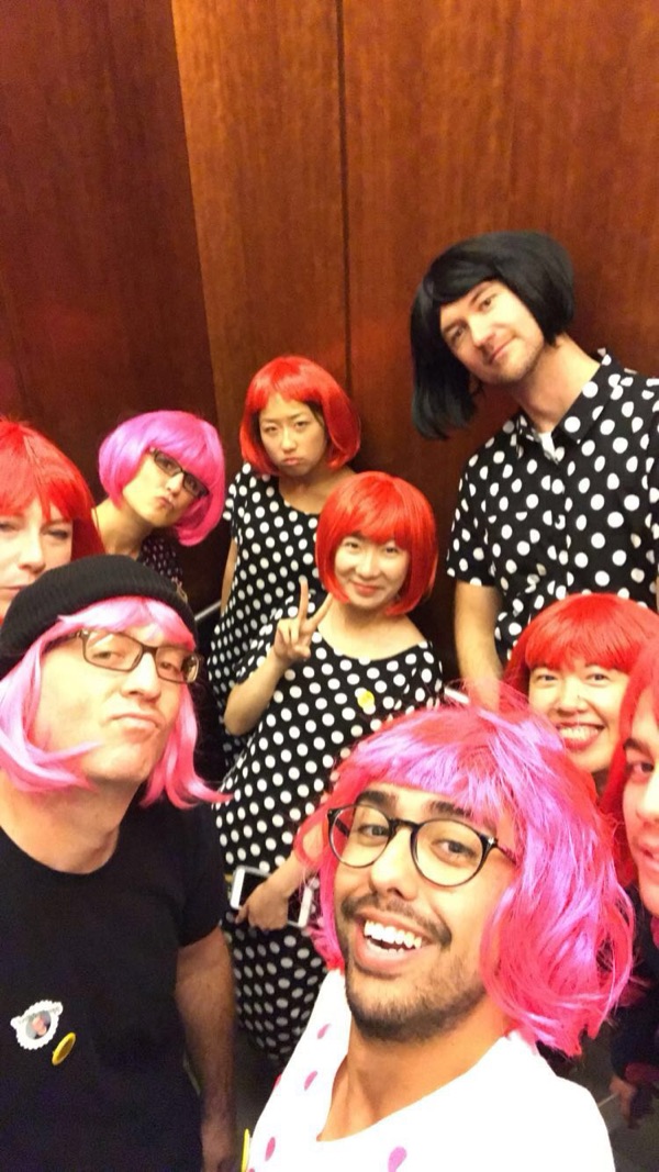
Halloween.
I was a fridge.I don’t take myself too seriously
I’m curious. I try things.real-time footage of me getting hooked on foiling
I put a lot of me into my work.just not my ego
New to me? I figure it out.like wiring a new electrical panel, permitted and inspected
- Built Zillow’s advertiser platform from almost nothing
- Ran research to raise ROI for ad buyers
- Made internal design tools for the ads org
- 3 years on Meta’s largest design system, focused on ads
Stories
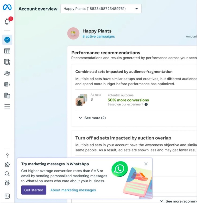
discoveryMeta ads tools · 2025
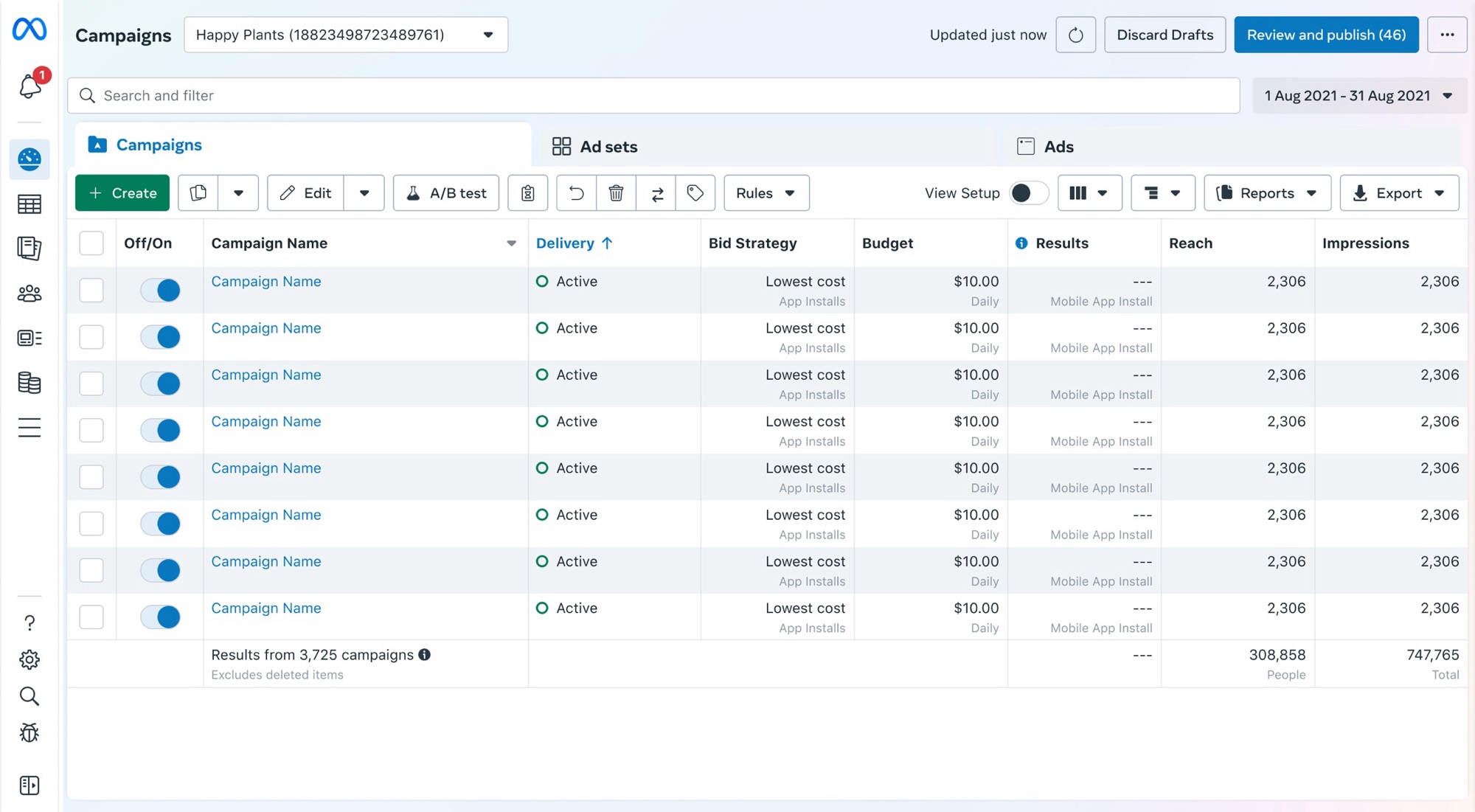

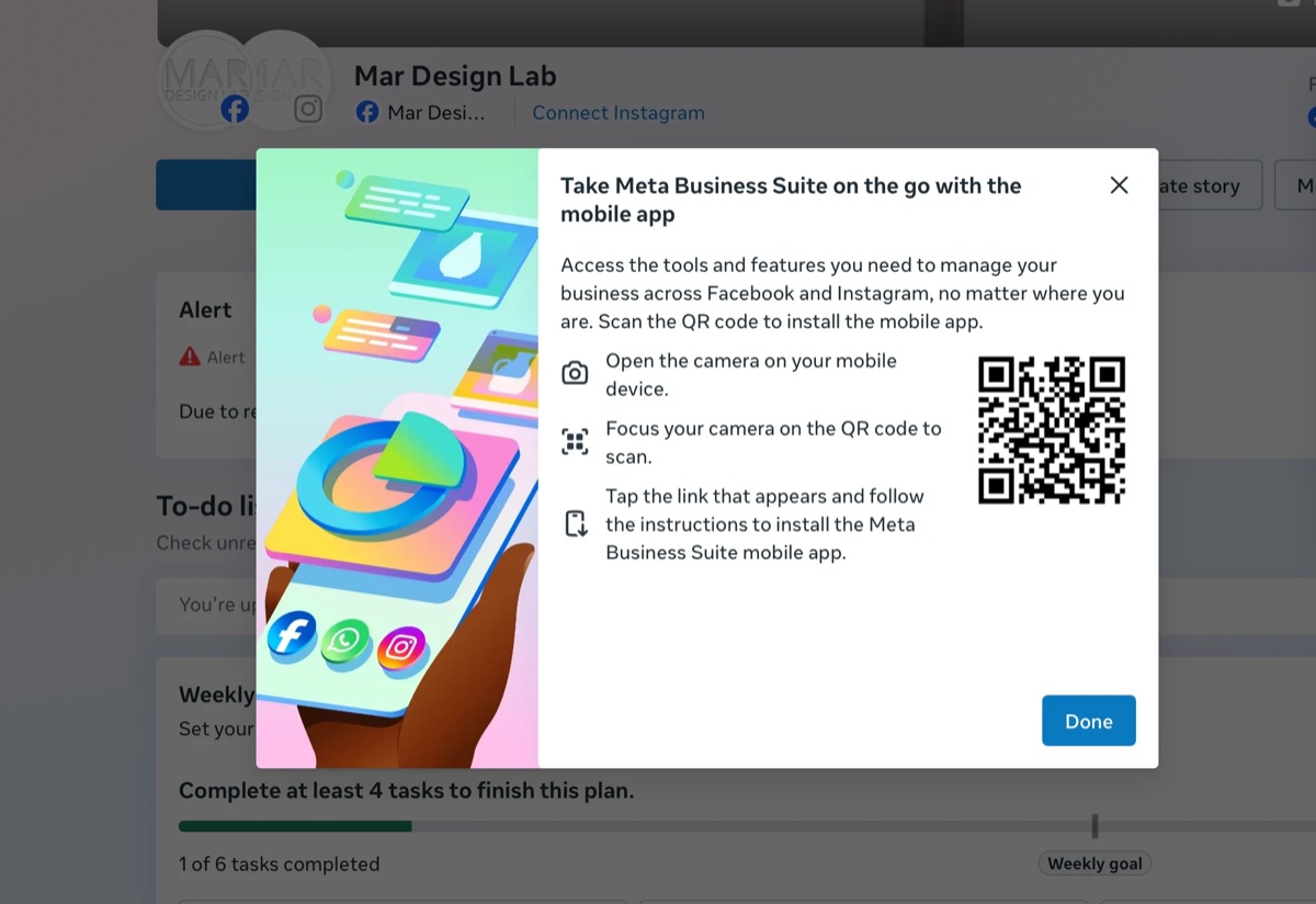
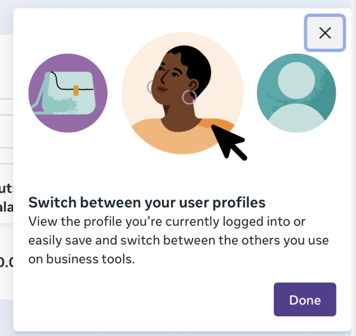
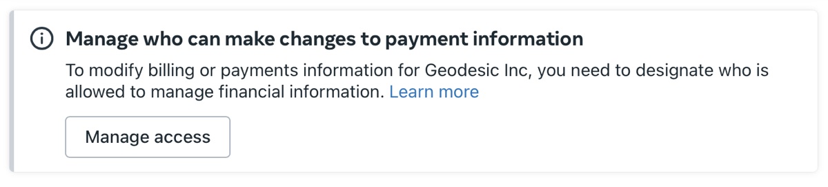
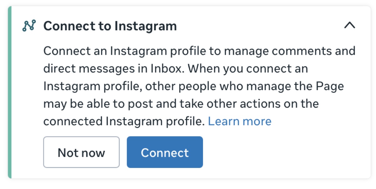
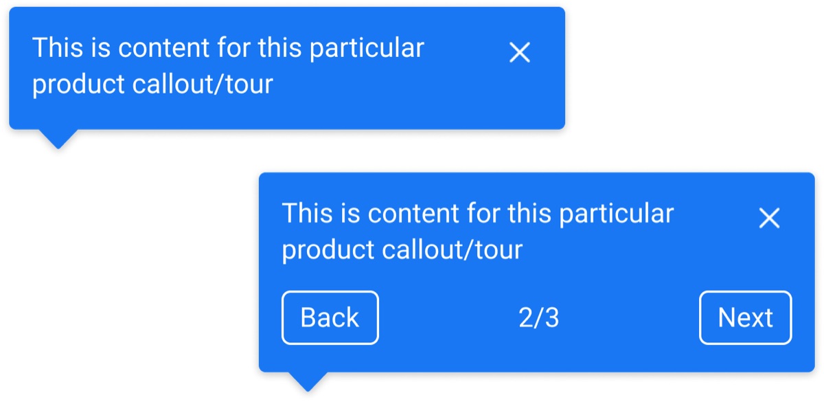

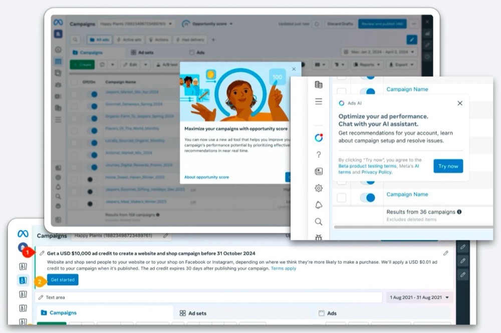
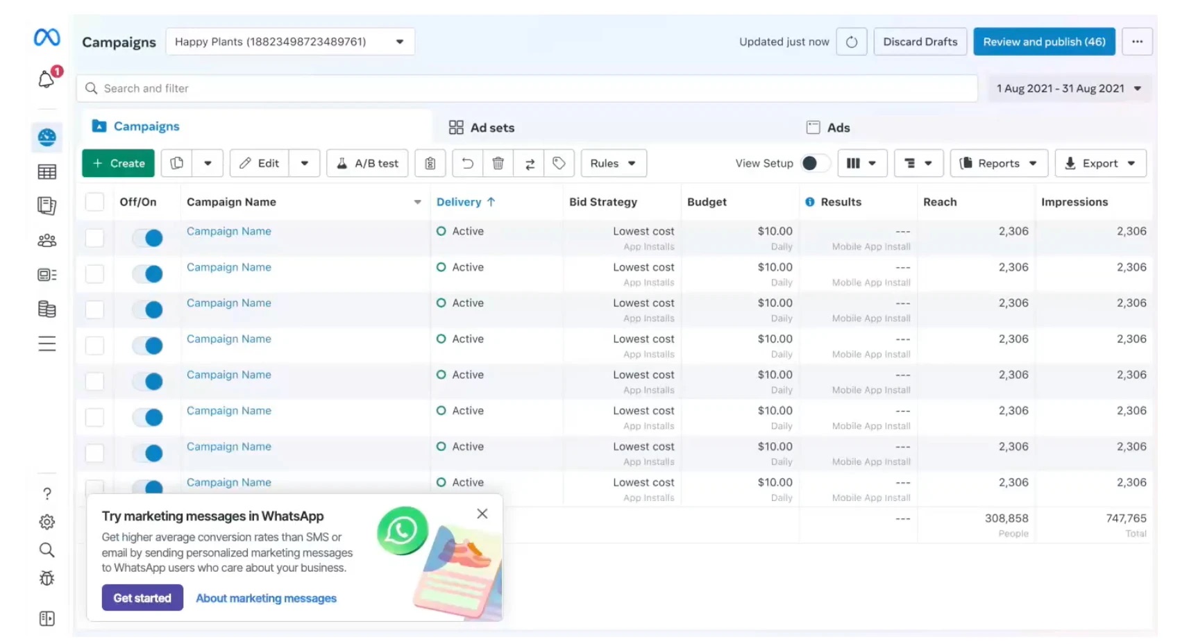
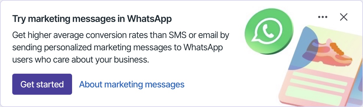
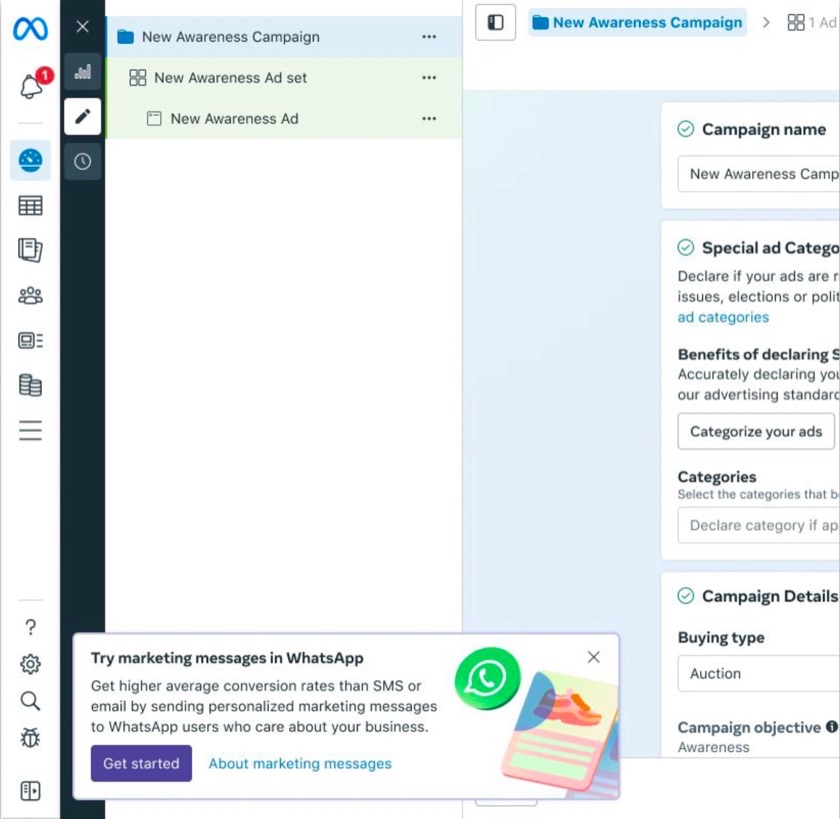
 Visit 1Visit 2Visit 3Visit 4
I want to learn about new features and what I can do, but I want to be in the right mode to learn about them. Otherwise, I want them out of my way.
Visit 1Visit 2Visit 3Visit 4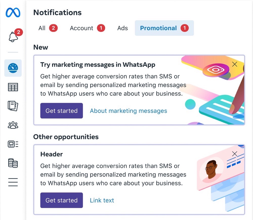
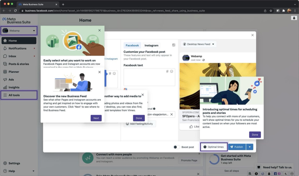
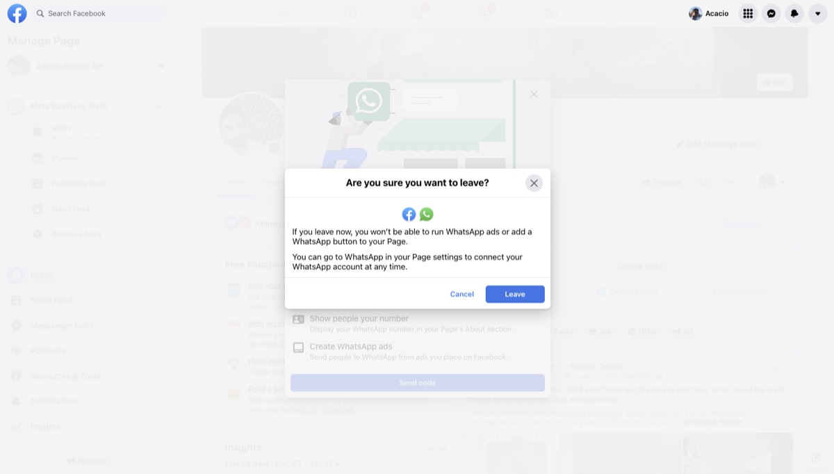
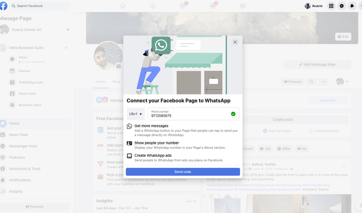
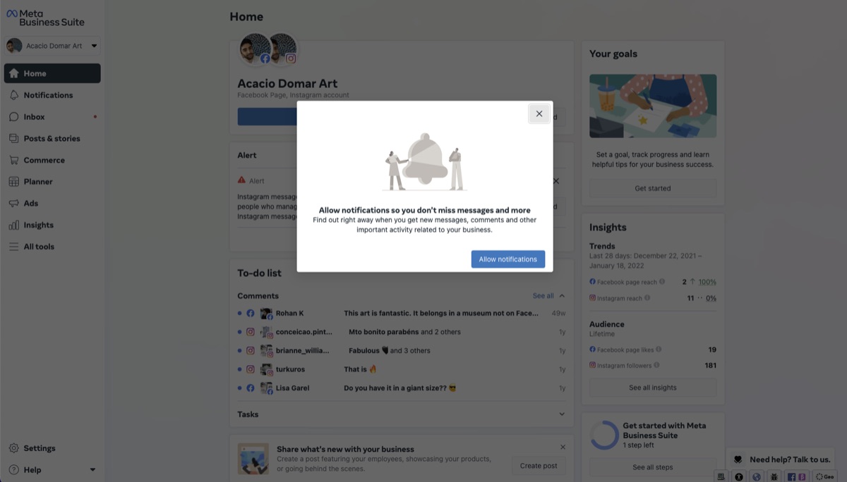
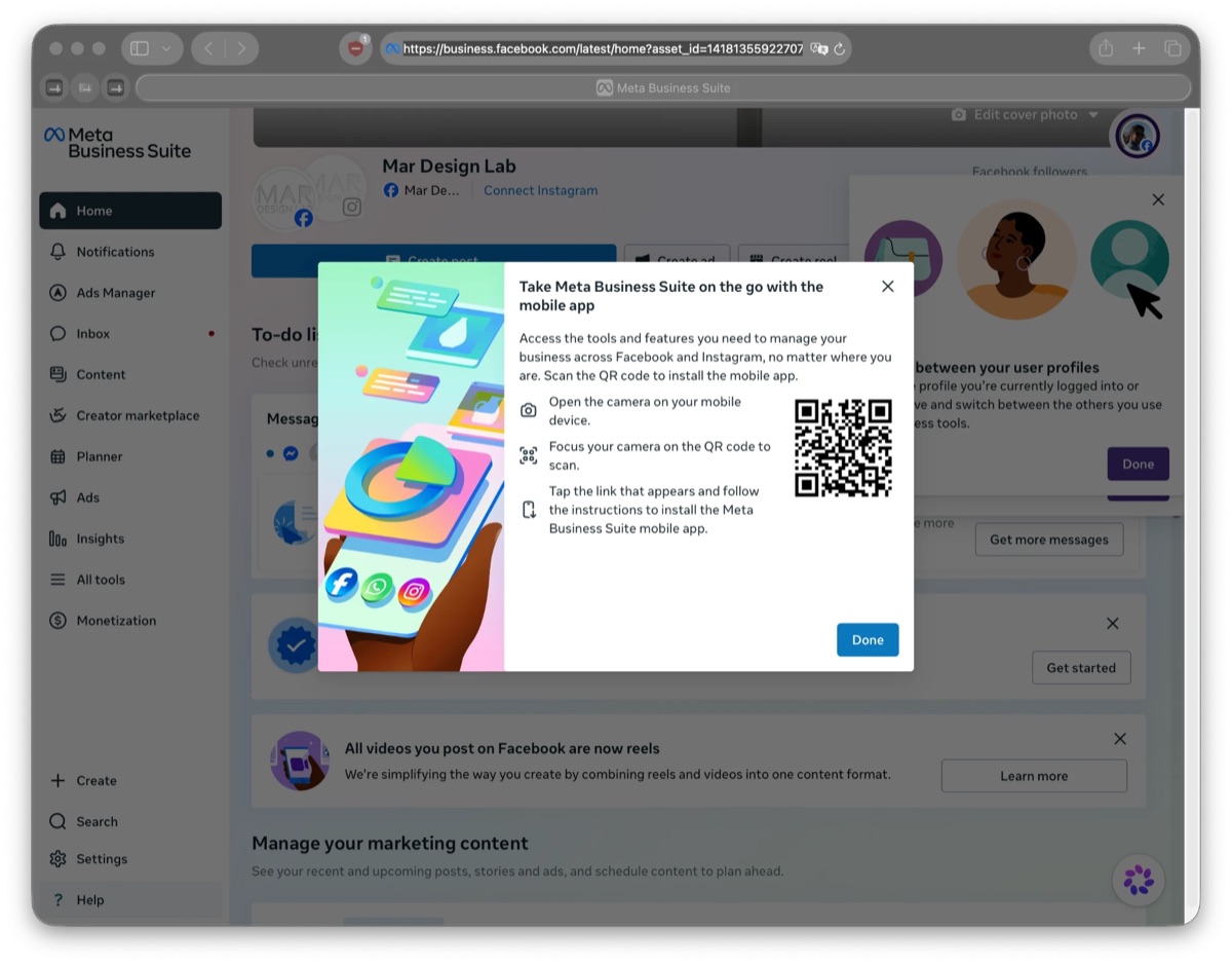
Every team was rewarded for shouting.so people closed the messages blocking them on sight
Nothing limited the blocking UI.they stacked three or more deep because our incentives, system and process failed to limit them
Removing them made money.which proved the problem was real and causing damage
I was asked to look into blocking UI.a side project that ran much deeper
So we did just that.we partnered with engineering tooling teams, design reviewers and managers on the phase 1 fixes, and aligned on the goals and what it would take
Fix the system, then the components.docs, reviews and tooling, before any new component
No guidance on what got a callout.teams added one before every launch, like a checkbox, whatever the change
Not every change needs a callout.we sorted by business impact, scale of change and common sense
Too many ways to say the same thing.custom components, and approved ones used the wrong way
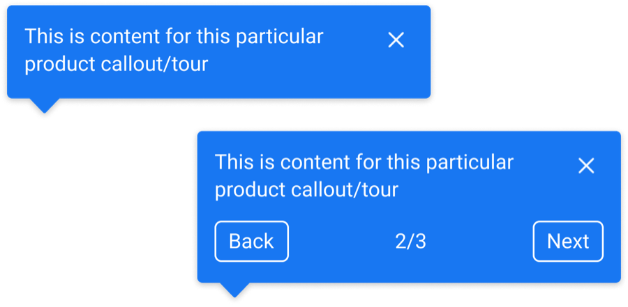
We didn’t need an additional component.we boiled the teams’ needs down to one reusable pattern, flexible enough to meet them
One popover to replace blocking modals.and it had to work everywhere
Two options, with clear rules.on a fixed system, with docs and governance behind them
Dismissed meant gone for good.so teams showed the same message again and again to get traction
People still wanted to learn.just at a better time and place, when they were in the right mode
Bet 1Messages had to prove their value.renewal was required every 6 months, and dismissals dropped, so the first bet held
Bet 2It waits until you’re there.and got more clicks than messages that showed up on page load
Bet 3Dismissed didn’t mean gone.still being measured in A/B testing
No more pile-ups.tooling did more than any new component
- Revenue
- Clicks
- Impressions
- Dismissals
in early testing
Sponsored by several VPs